Brand Style Guide
Everything a designer, printer or embroiderer needs so every future Yaadie Royale piece looks like it came from the same house.
Colour Palette
Caribbean Turquoise
#00A9B7
RGB 0, 169, 183
Primary brand colour: buttons, links, highlights
Sunset Coral
#FF6F5E
RGB 255, 111, 94
Accent: zips, badges, sale tags, secondary buttons
Sunshine Yellow
#FFC93C
RGB 255, 201, 60
Accent: crown detail, small graphic bursts
Palm Lime
#8CC63F
RGB 140, 198, 63
Accent: palm leaves, stripes, trims
Deep Sea
#0B3C49
RGB 11, 60, 73
Text, headlines, footers, dark backgrounds
Island Sand
#FCFBF8
RGB 252, 251, 248
Page background, garment tags, packaging
Ratio guide: roughly 60% Island Sand, 20% Deep Sea, 15% Caribbean Turquoise and 5% split between Coral, Yellow and Lime. Never let two accents dominate one layout.
Typography
Display typeface
Bebas Neue
Headlines, product names, garment tags. Always uppercase, always with extra letter-spacing.
Body typeface
Barlow
Body copy, descriptions, prices and buttons. Weights 400, 500 and 600 only.
- Display / H1Bebas Neue, 48–64px, letter-spacing 0.12em, uppercase
- Section / H2Bebas Neue, 28–32px, letter-spacing 0.14em, uppercase
- Product name / H3Bebas Neue, 20px, letter-spacing 0.06em, uppercase
- BodyBarlow Regular 400, 16px, line-height 1.6
- Small / labelsBarlow Medium 500, 13–14px, letter-spacing 0.02em
- PriceBarlow Semibold 600, 16–20px
Logo Specifications
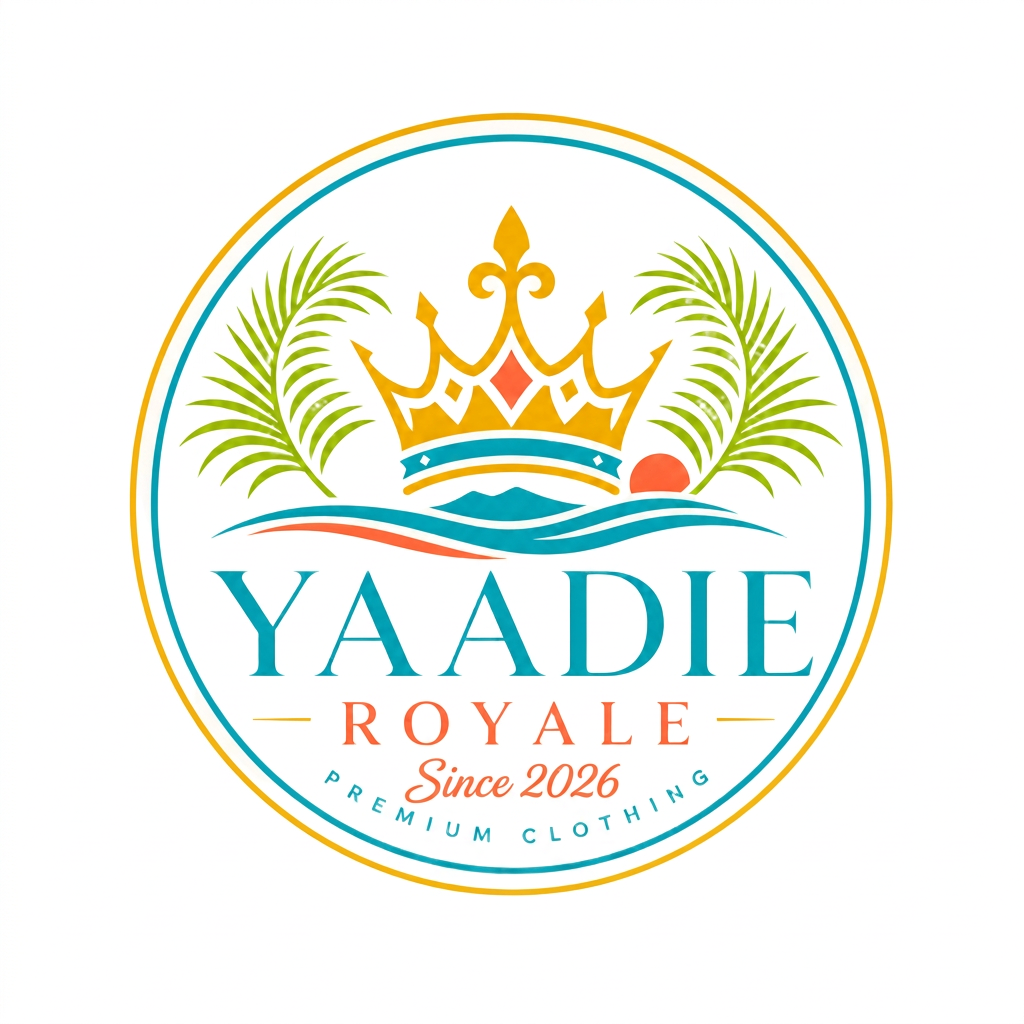
The crest is one locked artwork: crown, twin palms, island wave, the wordmark Yaadie Royale, the line Since 2026 and the ring text Premium Clothing, all inside a circular border.
Do
- Use the full circular crest on light Island Sand or white backgrounds.
- Keep clear space around the crest equal to at least 25% of its diameter.
- Minimum size: 24mm wide in print, 96px wide on screen, 40px for the icon-only mark.
- Garment placement: left chest 90mm wide, centre chest 200mm wide, cap front 60mm wide.
- Embroider in the four brand colours on light garments; single-colour Island Sand on dark garments.
Don't
- Do not stretch, rotate or re-colour the crest.
- Do not place the full crest on busy photography without a solid backing shape.
- Do not add outlines, drop shadows or gradients.
- Do not recreate the wordmark in another typeface.
- Do not use the crest smaller than the minimum sizes — the ring text stops being legible.
Voice, Imagery & Layout
Voice
Warm, proud, plain-spoken. Short sentences. Speak to self-worth, never down to the customer. Jamaican roots, global wardrobe.
Imagery
Natural light, real people, diverse casting. Studio shots on Island Sand for accessories and essentials. Crest always legible on garments.
Layout
Generous margins, 16px spacing steps, 16px corner radius on cards, square product crops, one accent colour per section.